Omada program enrollment

My role

Product Thinking, Information Architecture, Interaction, UX/UI design, Prototyping & testing

Duration

8 Weeks

Platform

Desktop
Responsive Tablet & Mobile

Team

Research, 1 Designer, Data, Marketing, Product manager, Clinical, Engineers, Content

Background

As part of my role at Omada, I contributed to the ToFu (Top of Funnel) team, which concentrated on enhancing the Pre-Program journey. This initiative encompassed the entire process, starting from when potential participants first learn about Omada, through the enrolment phase, and extending to their initial weeks of Activation.

A key focus of our team was to refine the enrolment process, particularly the risk screening stage, which is important in assessing the clinical eligibility of individuals for the program.
What we knew

By looking at the data, we saw a large number of people dropping off during enrolment. Of all the people that visited the landing page, only 37% of them started the risk screener, and by the time they submitted the application, 50% of them were dropping off.
Current enrollment overview

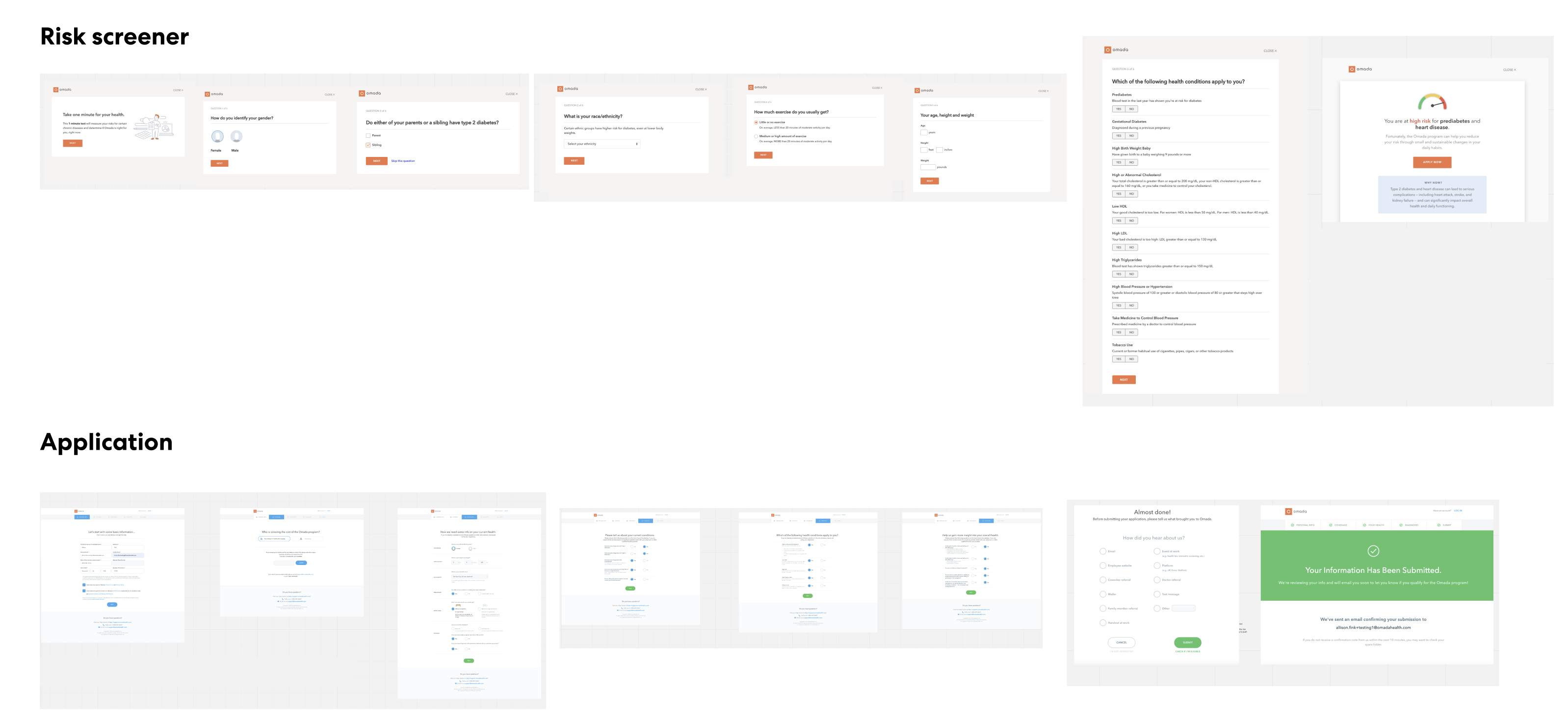
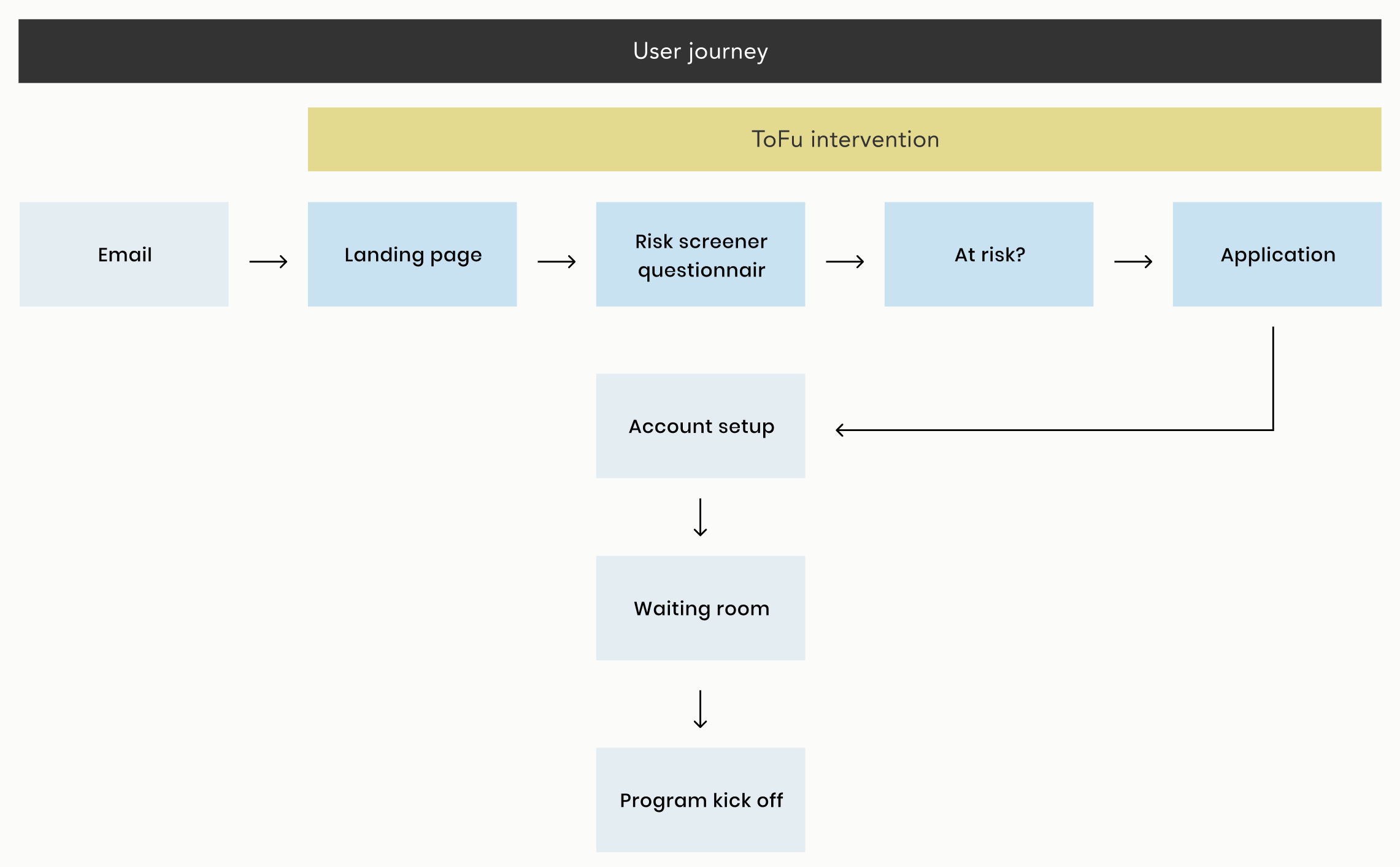
The previous enrolment experience at Omada consisted of a two-stage process. Initially, participants underwent a risk screening to assess their health risks. Those who qualified as eligible in this phase, were then directed to the application stage, where they were asked more questions about their medical history.

Problems

When it came to identifying the problems, we knew that:
- The flow required significant commitment (16 screens), all of which are focused on Omada getting information from the user
- The risk screener and application were treated like two different flows, even though most users completed them in sequence.
- We asked the users to provide personal information without any reassurance of why
the questions we asked were focused on acceptance criteria only.
- Users applied to the program without fully understanding what the program involved.

Goal

The main goal was to redesign the risk screener and application flow to reduce friction and drive more enrollments. Our assumption was that improving the design of our risk screener and application flows could have a significant impact on enrolments.

Participant journey

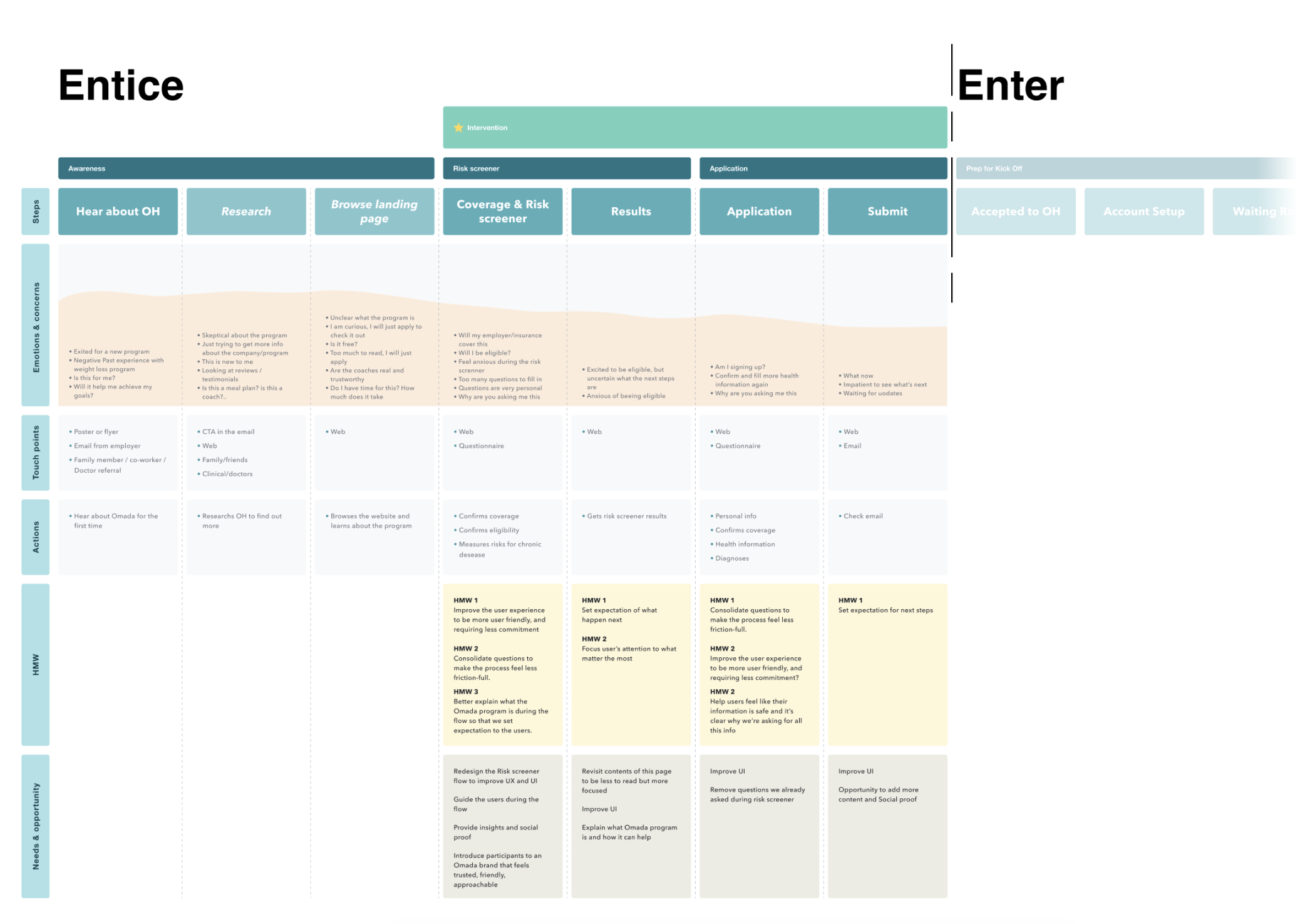
To have a better context about the project, I designed the participant journey when going through each of the steps, including emotions and concerns, "How might we" statements and opportunities for each single step that we can work on to improve the overall user experience and to keep the users motivated.

Proposed opportunities

After collaborating with the team, I came up with things we could address to help increase enrollments.
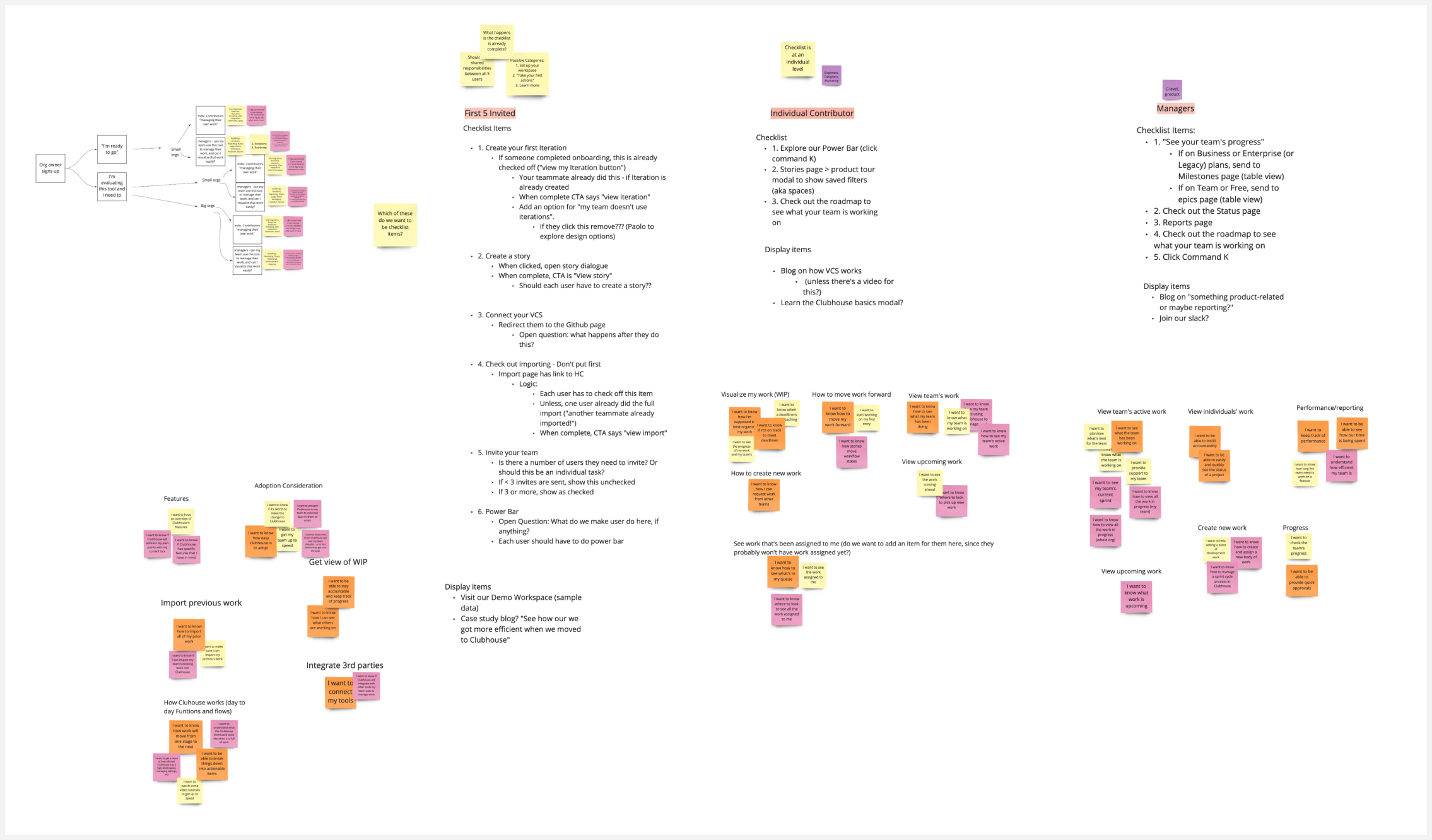
- Remove duplicate questions and unify the two flows in the eyes of the user.
- Add a few basic questions at the beginning of the flow about user’s goals and motivations and uses this information to personalise the screens in the application.
- Add some content screens to the flow explaining more about the program.
- Unify the design to be consistent with the Omada brand and voice.

UI variants
What we shipped

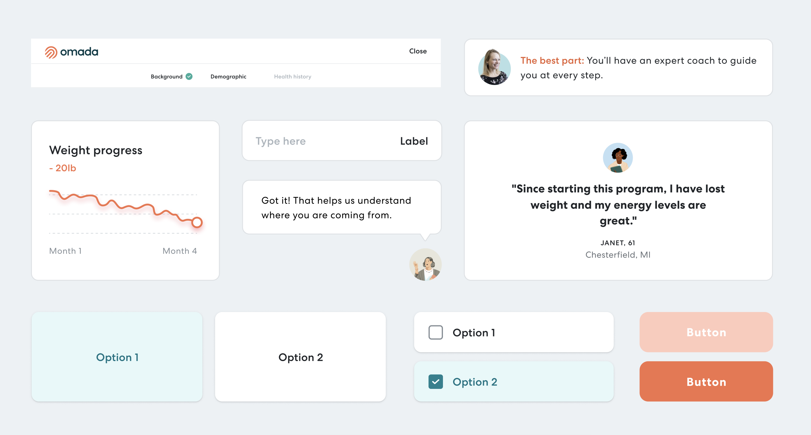
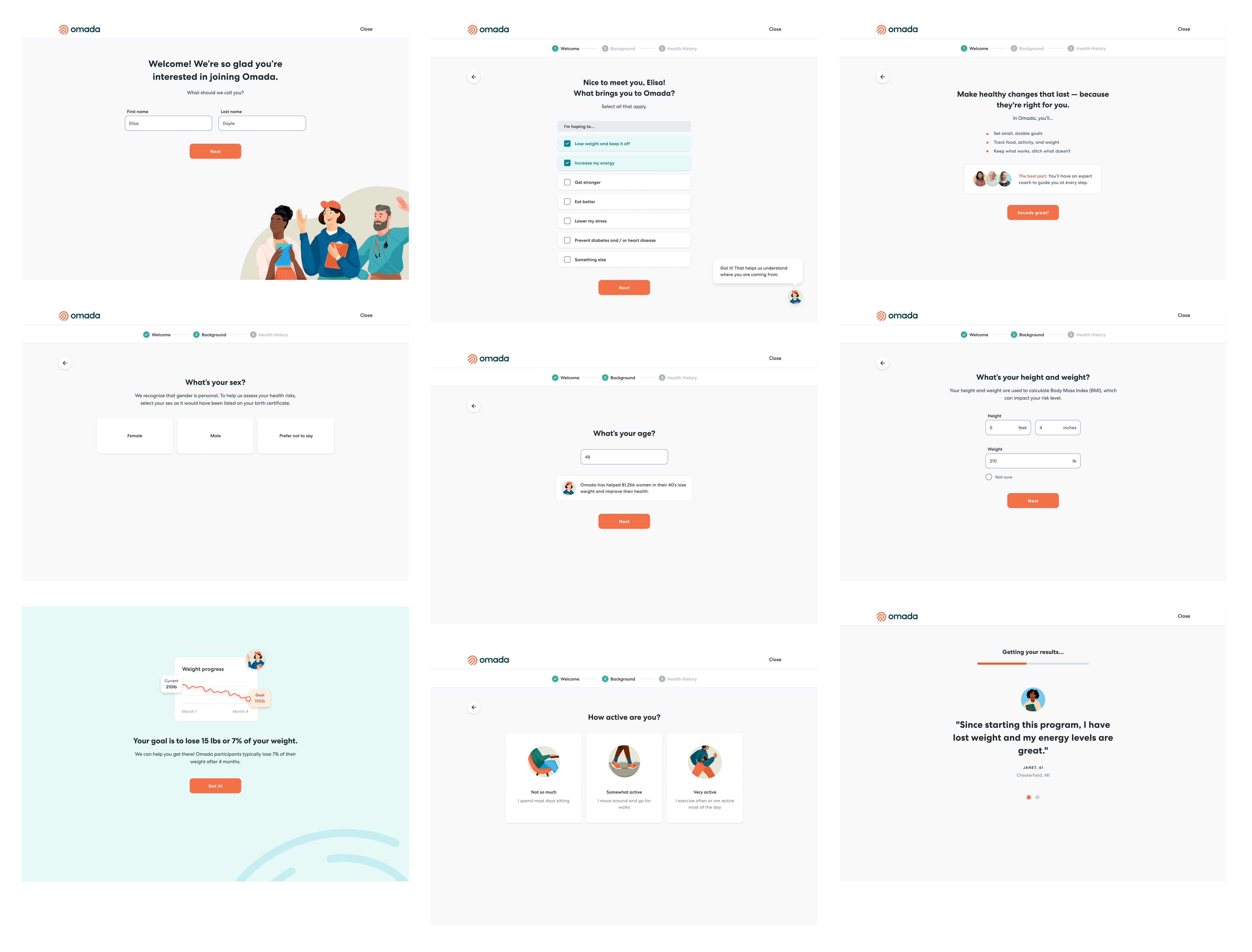
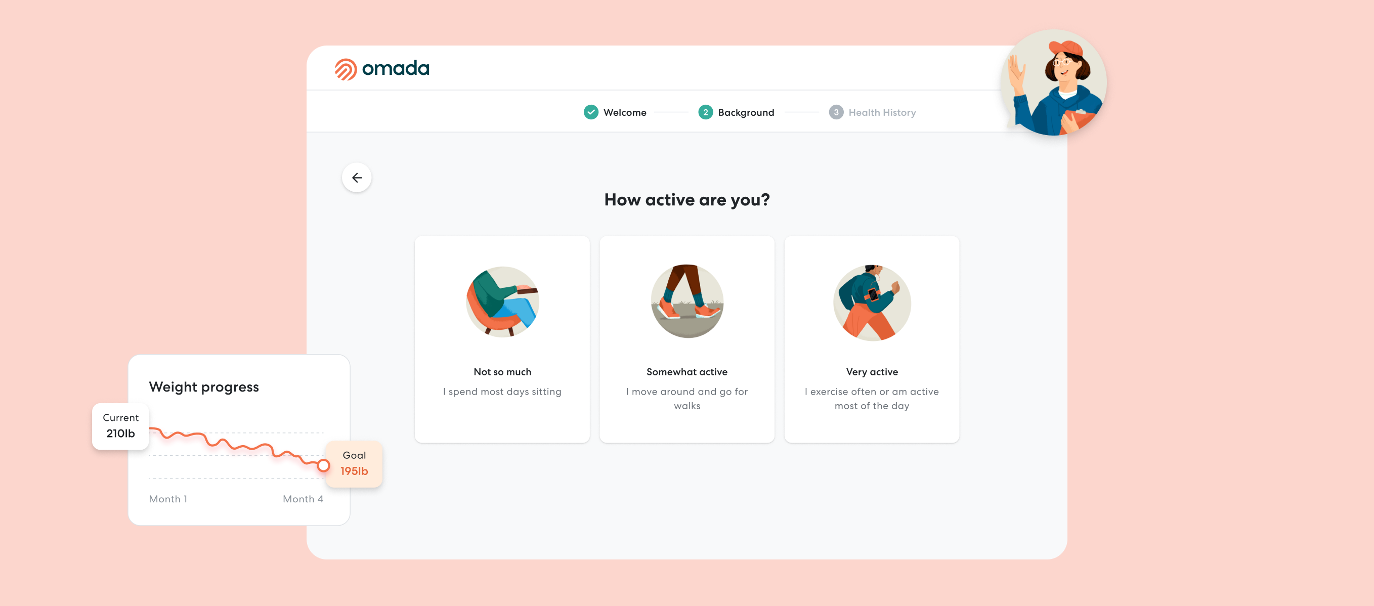
What we designed and shipped is a more user-friendly approach to guide participants through Omada's assessment flow, focusing their attention on one question at a time to make the flow more digestible. We also introduced a more friendly UI, including animations and illustrations that added delightful moments to this experience.

Next up

Provider Data Sharing

Exporting and sharing health data with providers to get better care.