User research
Conceptual thinking
UX/UI design
8 weeks
Research, Design, Data, Product manager, Clinical, Engineers, Content
Omada allows participants with Type 2 Diabetes to track a huge amount of medical and behavioral data such as blood glucose, meals, weight and activity over time. Despite tracking this meaningful data, Omada did not provide a way for participants to share it with their health care providers.
The patient-provider relationship is extremely important for managing Type 2 Diabetes. A huge part of this, is the providers ability to quickly assess how their patient is doing over time with their condition by examining their health data. The medical and behavioral data captured by Omada could be incredibly beneficial for providers understanding their patients better.
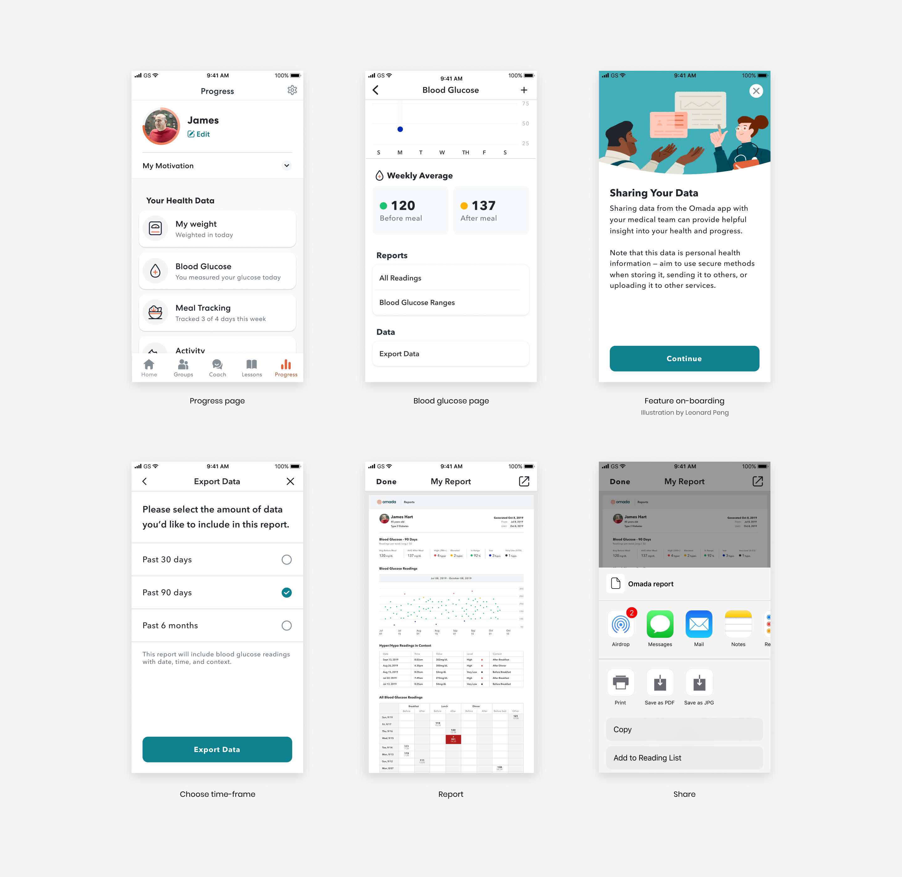
To solve this problem, we wanted to create a feature that allows participants using the Omada App to export and share their data with their healthcare providers. To get the most out of this feature, we knew it needed to display the most relevant health data to providers in an understandable way.
We hoped that this new feature would enable participants to easily share their health data, optimize their time spent in healthcare appointments and encourage them to continue using Omada to manage their condition.
We conducted interviews with participants and providers to answer important questions that would drive our design solution:
1. What type of health data is most relevant to providers?
2. What problems are providers trying to solve at each patient touchpoint?
3. How are participants currently sharing their health data with providers?
We discovered that it was very important for providers to understand what happened since the last visit. This indicated to us that the frequency of sharing the historical record depends on how often the participant is seeing their provider(s).
Providers also mentioned that they don’t have time to look at all the data in a multipage document full of numbers prior to and during the appointment. . Instead, they want to focus on what is important like blood glucose values and get an overall sense of the patient’s health since the last visit. Providers reported that they would like to see trends, but most importantly to quickly identify blood glucose values that were outside the healthy range.
From interviewing participants, we learned that some were already showing their providers the Omada App on their phones or taking screenshots and attaching them in messages to their providers. Some would bring their glucose meter or notebooks with hand-written values to their appointments. While others weren’t even sharing their blood glucose values with their provider.
From our qualitative interviews we discovered that most providers do not have time to look at files shared with them ahead of an appointment with a patient. Therefore, we had to optimize the data reports for participants printing and sharing them in person with their provider.
To assess which file format was best for the data export we conducted quantitative surveys with Omada participants. In the survey, we asked participants questions about how they prefer sharing data and what file formats they have used in the past to share data with their provider.
A good percentage of participants surveyed reported that they have shared a .pdf with their provider (via email, message, or portal) in the past. While others reported that they’ve shared a .png or .jpeg via these same channels.
We decided that it would be best to start this feature with a .pdf export because most participants are familiar with this format and we want to optimize for print/sharing of multi-page reports.
Of the data we track, the most useful data participants can share with their providers are:
- Individuals blood glucose values
- Blood glucose values over time
- Context about blood glucose values (time, meals, activity, notes)
- Activity over time
- Weight loss over time
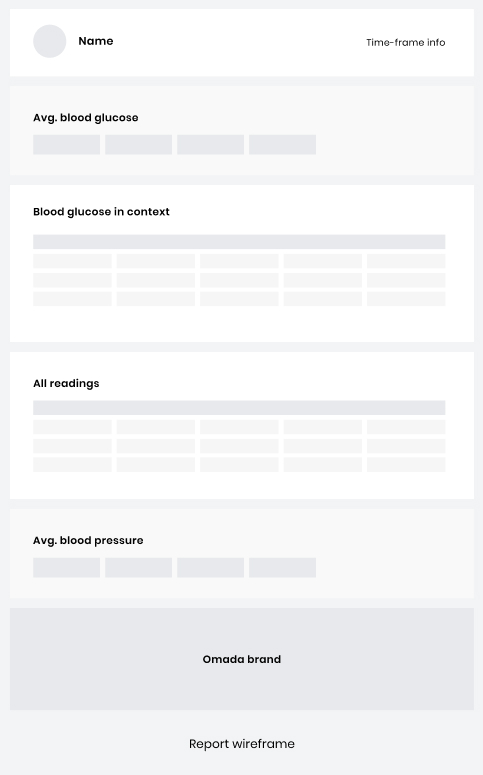
Because of a limitation in how we track data, we cannot provide the full context (e.g. meals, activity) of blood glucose values in the report participants share with their providers. Therefore we focused our solution on the meaningful data we can currently share with providers about blood glucose, such as averages, in range and out of range values, values in context (time) and all the values for the pre-set time period.
On the participants end we established the functional requirements to allow them to export their data:
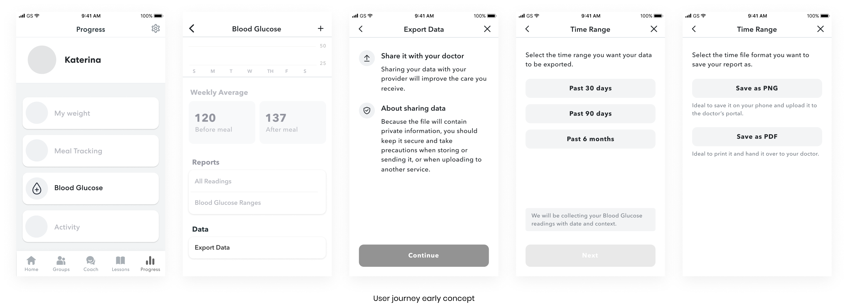
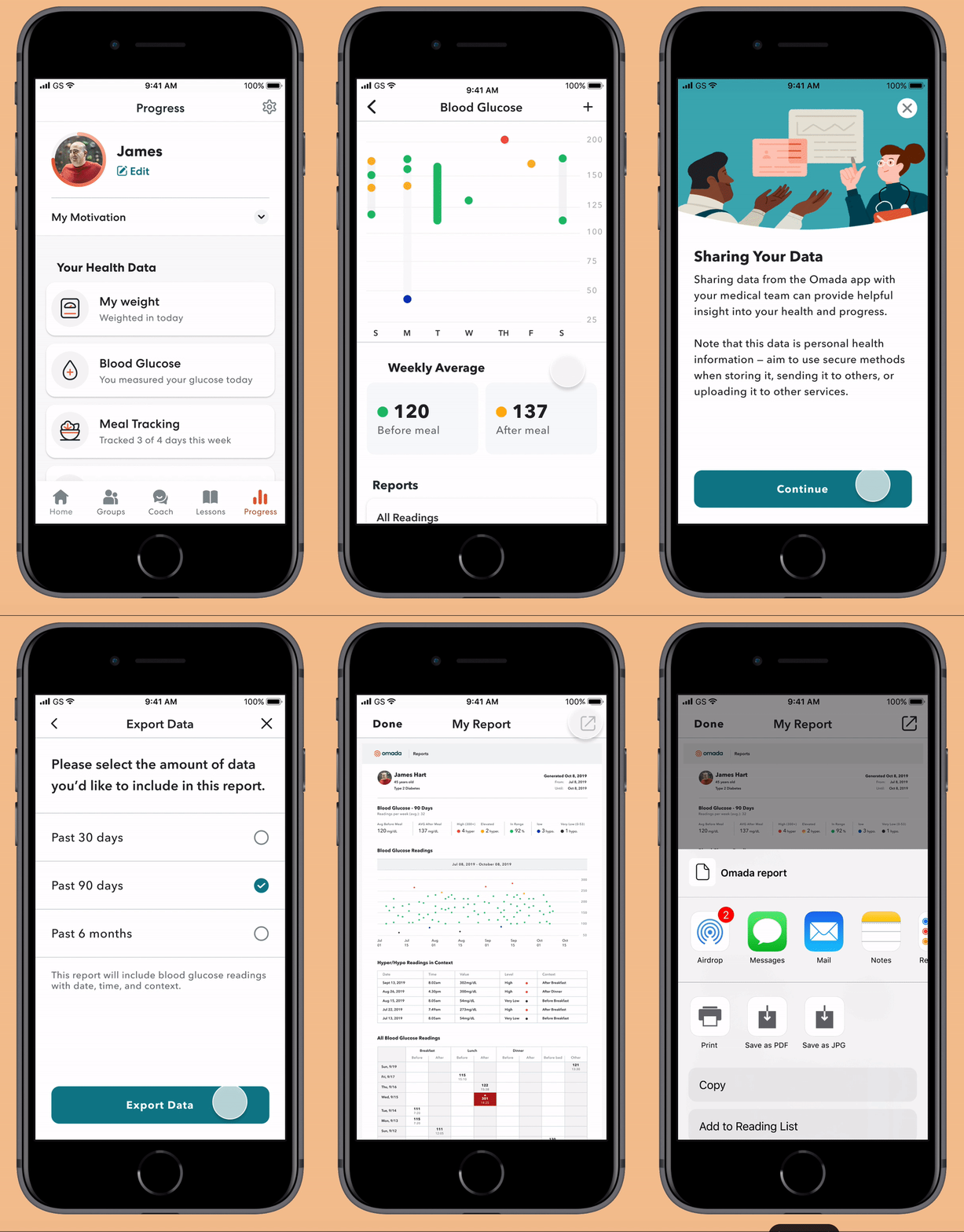
- Create an in context call to action to share blood glucose data;
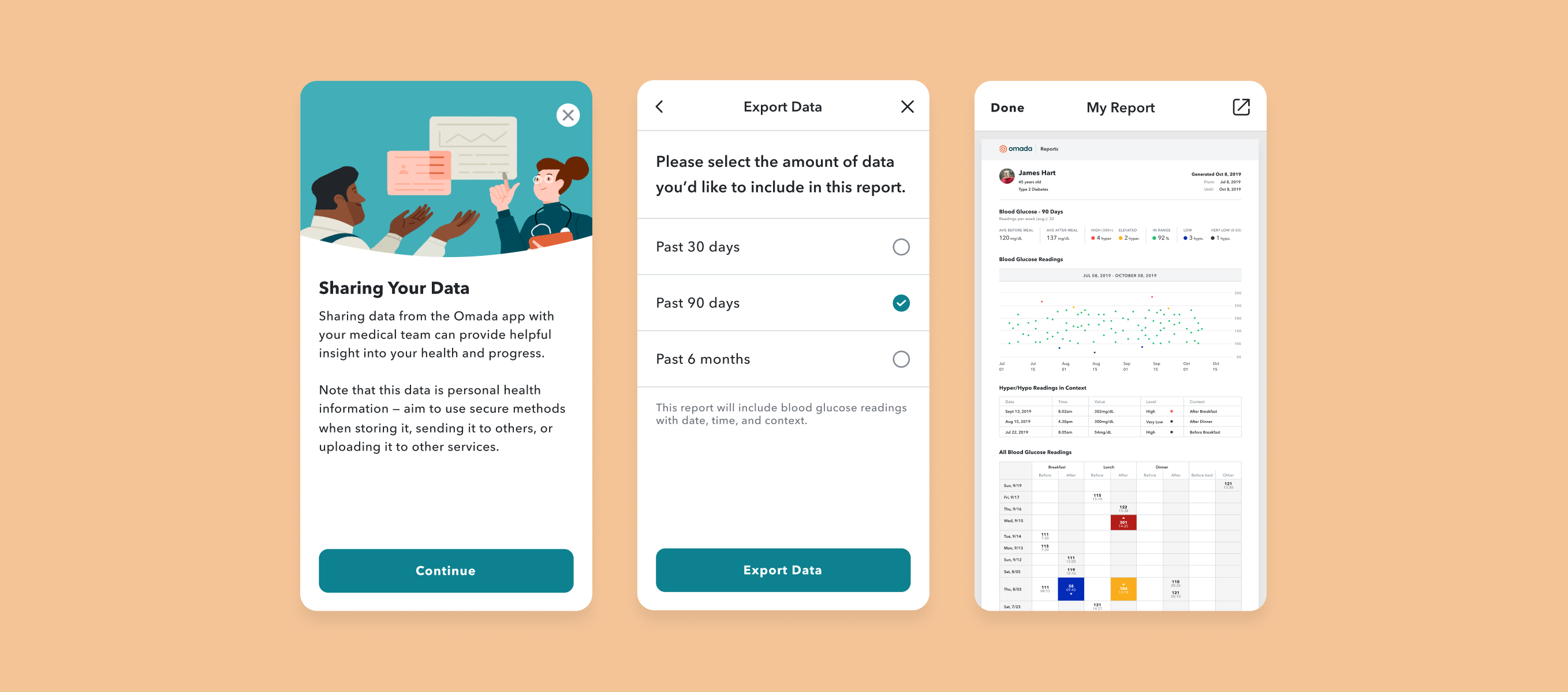
- Provide information on the purpose of the feature and the responsibility of sharing data outside the product;
- Choose a pre-set time period for the report (30 days, 90 days, 6 months);
- Preview the report;
- Export the report and choose action (save, print, download)
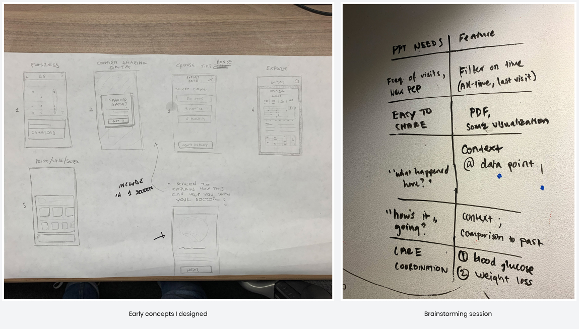
After brainstorming with the team, I started to put together low fidelity wireframes to tackle the structure and architecture of the information. I led the design process from early stages up to the final design, making sure to include short milestones to connect with the rest of the team to gather feedback and check on the feasibility of the features.
After collaborating very closely with the team and taking into account the knowledge from our research, we designed and built the first version of the feature that meets user needs.
Data sharing is now available on three different platforms - web, iOS and android. The feature was also a way for us to learn about data sharing out in the real world and gather feedback for future iterations.
For future iterations, we should explore ways to improve and expand the kinds of data we collect from our participants and how it is structured in our program, so we can provide connected context to help both patients and providers understand the why.
*Special thanks to Leonard Peng for the illustration.