Nuvo Wellness

My role

User research, Product Thinking, Information Architecture, Interaction, UX/UI design, Prototyping & testing

Duration

3 Weeks

Platform

Desktop
Responsive Tablet & Mobile

Team

1 Designer, Founder

Background

Nuvo is a health and wellness program with a whole-body approach that  targets nutrition, fitness and psychology to help people live a healthier and happier life.

The program provides a range of plans as well as 1:1 coaching. The founder needed a user-friendly website to allow users to browse the right plan for them as well as highlight Nuvo’s value proposition, which will result in greater conversion.

Research

I started by conducting user research to better understand what users need and what problems they typically encounter when navigating health and wellness websites. The aim was to understand how to design the interface to guide users to achieve their goals quickest.

Online Survey

I conducted an online survey with the target audience to identify user requirements, goals, behaviours and pain points as they navigate health and wellness websites. From the survey, I gathered both qualitative and quantitative insights.

Key Findings:
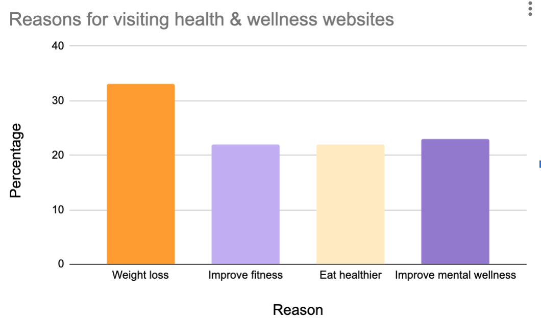
- The majority of users visit health and wellness websites with the goal of finding fitness, nutrition and weight loss plans.
- Some users want to follow a generic plan, while others want something more personalised or more support via coaching.
- Almost 80% of users who visit health and wellness websites don’t find what they are looking for and leave without making a purchase.
- Users felt frustrated by the quantity of ads on health and wellness websites.
- Users disliked that plans were in pdf format.
- Users wanted to know the reasons why a plan worked and how it could help them achieve their goals.
- Users lacked enough information to help them make a decision.
- Users felt overwhelmed by the number of options on websites.
Competitive Benchmarking

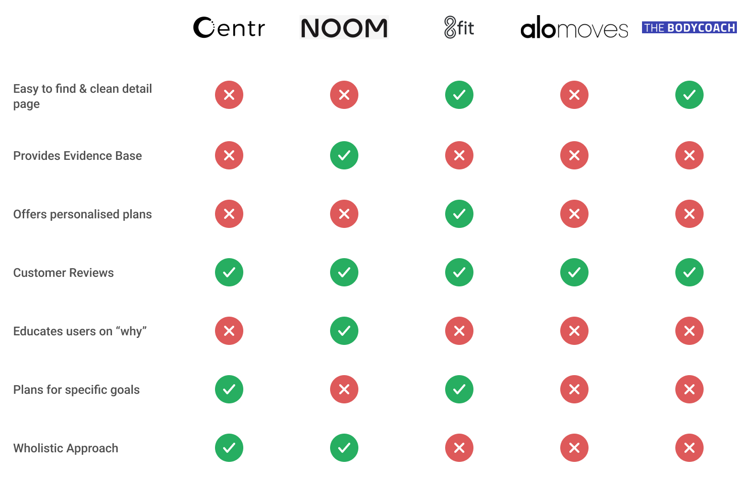
I conducted competitive research of leading health and wellness websites to understand best-in class examples, users mental models and to define the basic website features.

Key Findings:
- Most health and wellness websites do not provide the user with adequate information to make a decision.
- The majority don’t provide any evidence base or inform users on why the products can help.
- Only some websites have clean detail pages that are easy to find.
- Most websites display customer reviews to show clients what others have achieved.
- Only some websites offer personalised plans or options tailored to specific goals.
- Only one website offered customers more support with coaching.

Affinity Diagram

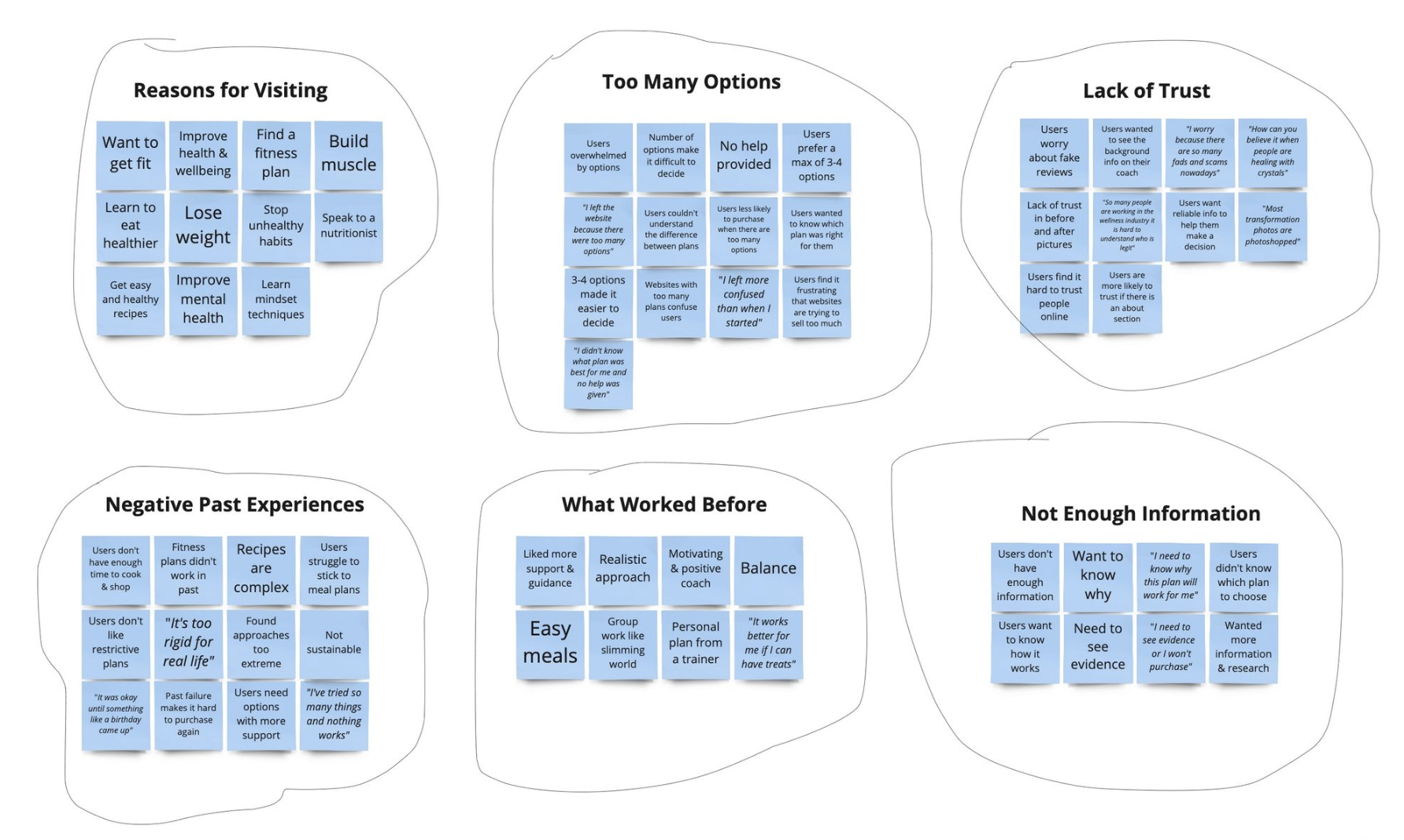
To make sense of the research findings, I created an affinity diagram. All notes were transferred into a Miro board and I organised them into teams. A total of 6 themes were created and they were appropriately labelled.

The website

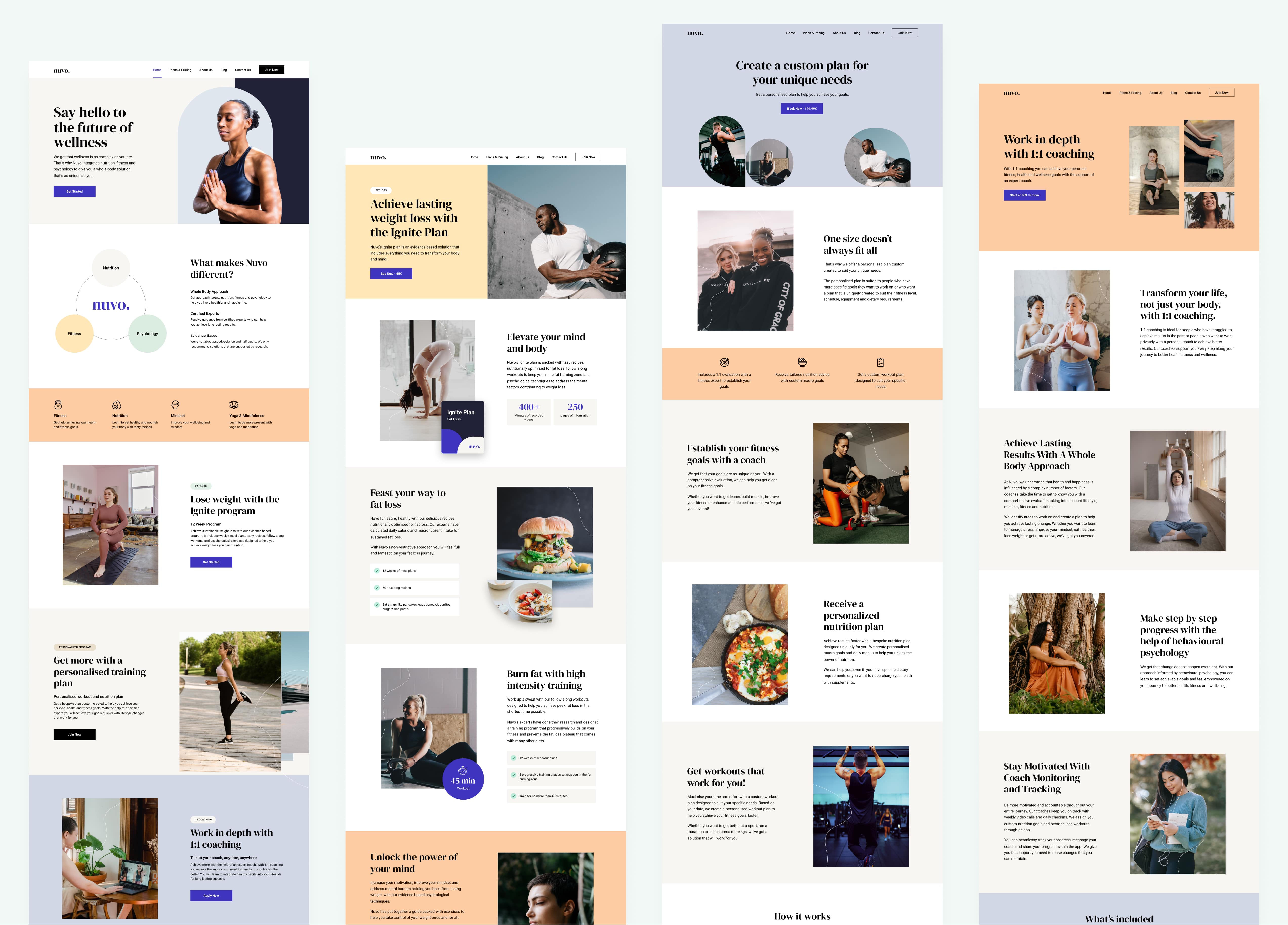
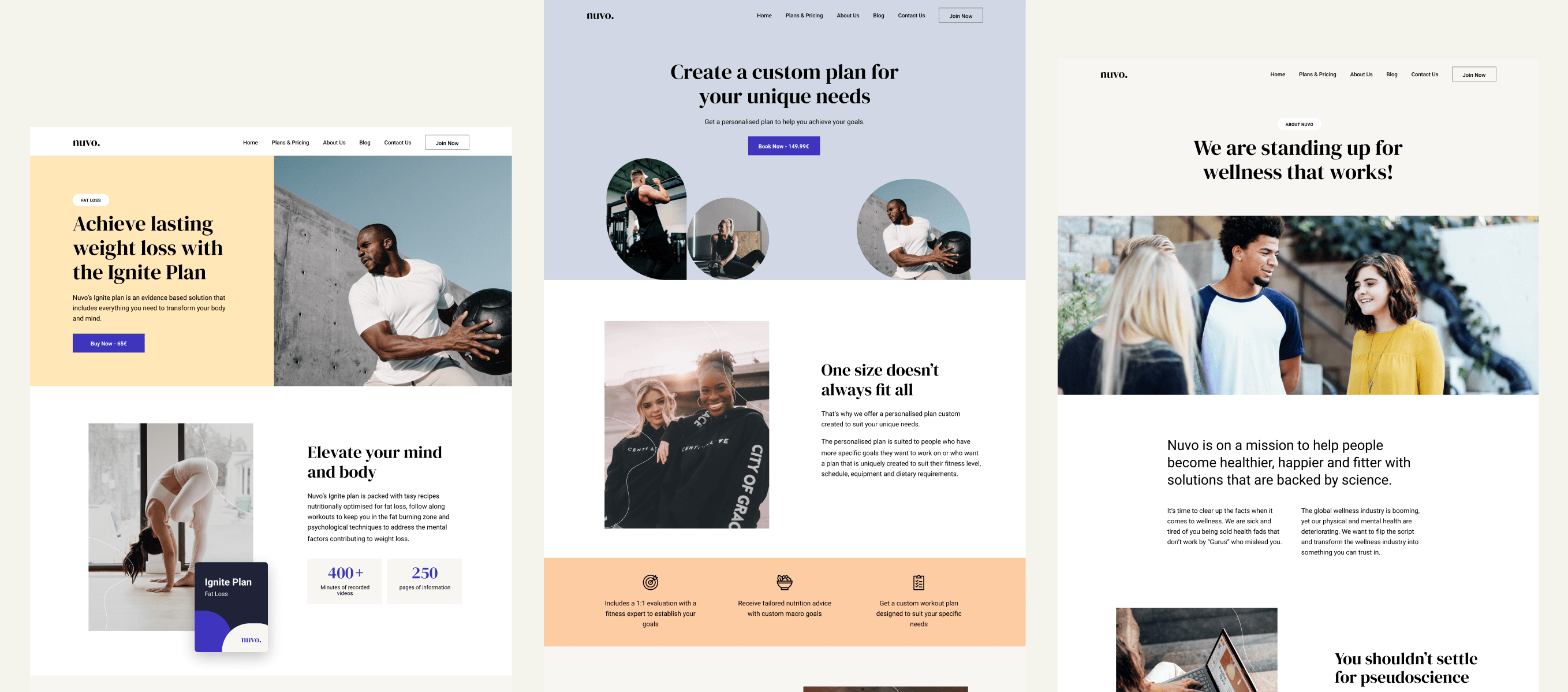
Here is the final website we put together to help users find and purchase the plans, programs and coaching that works for them.

Visit Nuvo Wellness

Next up

Blockchain in Healthcare

Sharing and updating medical records through Blockchain.