Blockchain in Healthcare

My role

Brainstorming
User research
‍UX/UI design

Duration

10 weeks

Platform

Desktop
iOS

Team

Design, Product manager, Engineers.

Background and Problem

The Blockchain in Healthcare is a project that intends to promote healthcare data sharing between different healthcare stakeholders and patients. Typically, when a patient is attending an appointment with a new provider they need to bring along all of their documents such as medical records and tests.

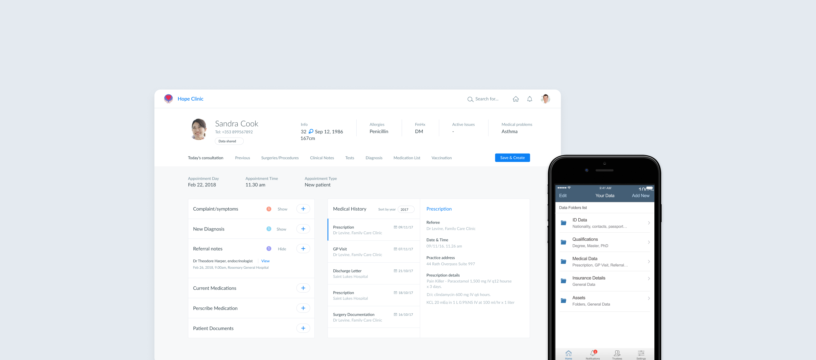
To solve this problem we wanted to create an app that allows patients to easily access their medical data and share their records with new trustees (hospitals, clinics, doctors). We also wanted to create a connected dashboard for the trustees to update the patient’s records during a visit. In the app, we wanted patients to be able to specify the type of data they want to share as well as revoke access to a trustee when they are changing hospital. This is all done through the blockchain.

Vision & goals

My team and I had a clear vision of how an app like this could improve peoples' lives and wanted to create an experience that would match our vision perfectly.

After a number of valuable meetings, we all came to the conclusion that the app needed two things: (1) a user experience that would drive the users to complete the steps and goals, and, (2) the power of a user friendly design.
User Centered Design

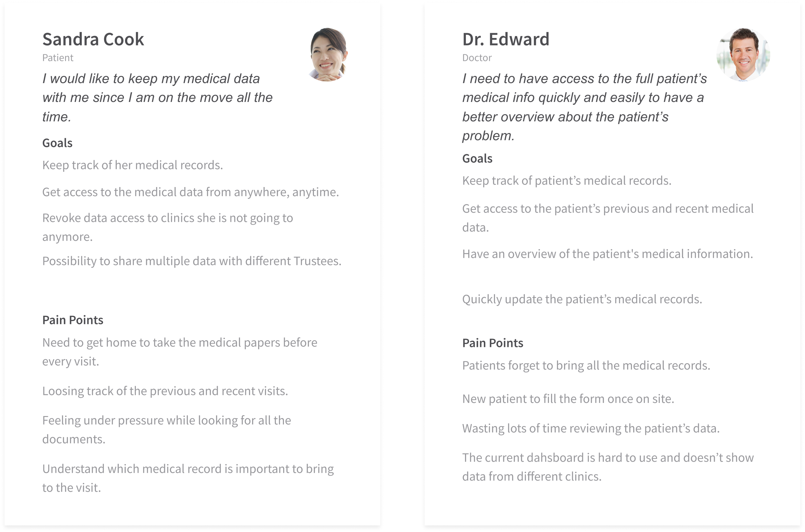
Just like for any of our projects, we had to understand the scenario and the users inside-out.
We identified two personas we'd keep in mind while defining user goals and user flows. We had a clear picture in mind of what the target audience was.

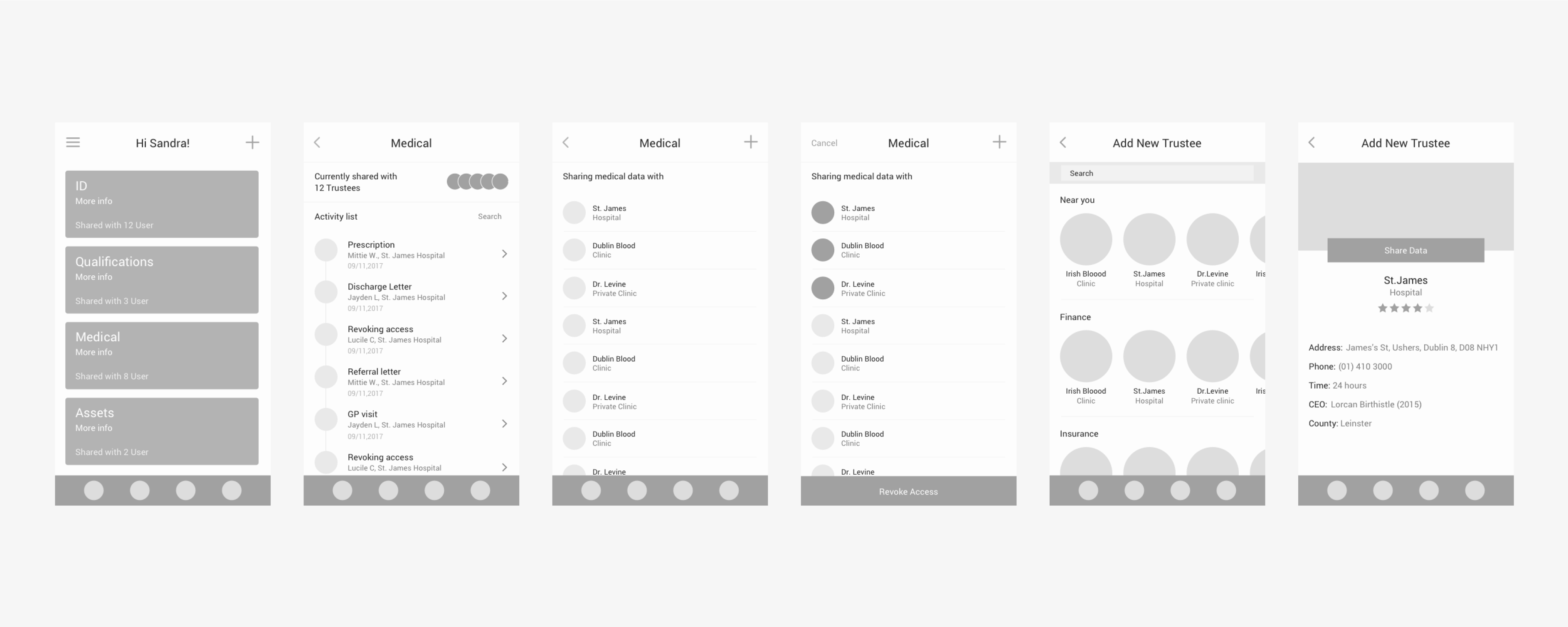
Wireframes

Based on the user’s pain points and goals, I started to conceptualise the flow of the app drawing hand sketched wireframes.  This allowed me to get an idea about which concept worked best for the user and  was solving the problem.
Based on this structure, wireframes, user flows and the UI designs evolved.

Shaping the app screen flow

To build a solid information architecture and user interface, we wanted to evaluate every decision made, question the relevance of each feature and determine how to implement it.

After laying down a solid foundation we moved on to turn the wireframes into polished designs.

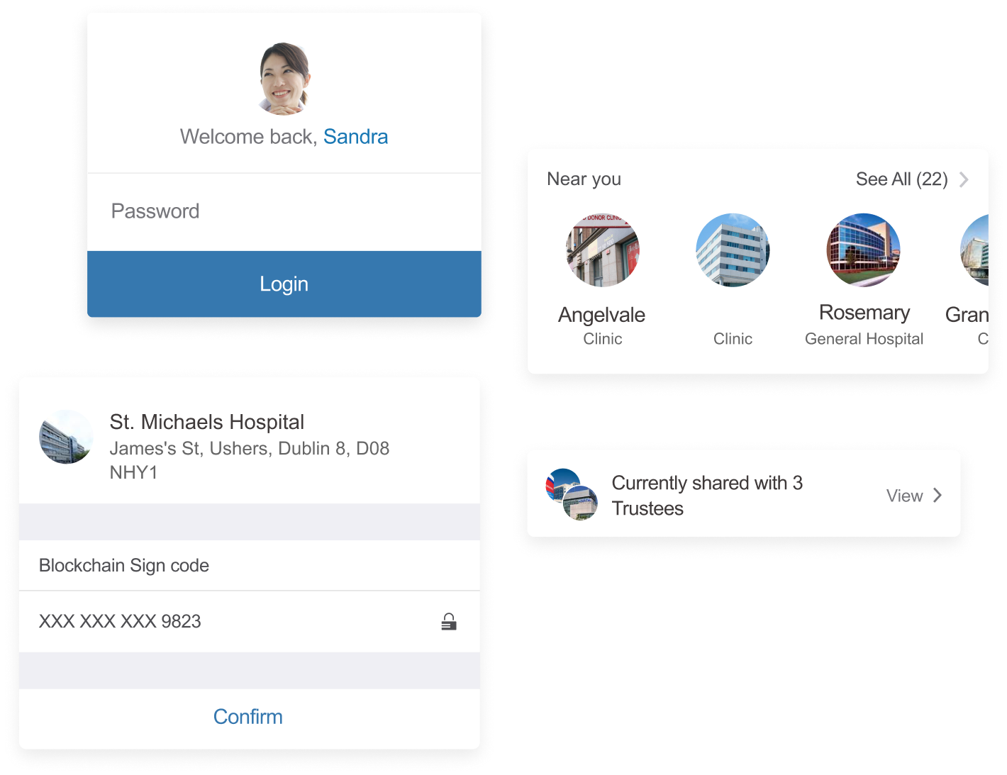
Appealing User Interface elements

Most importantly, we looked for the right approach that would make users comfortable managing important data such as medical records.
We created a consistent library of user interface elements that looked iOS-like, but yet custom designed.

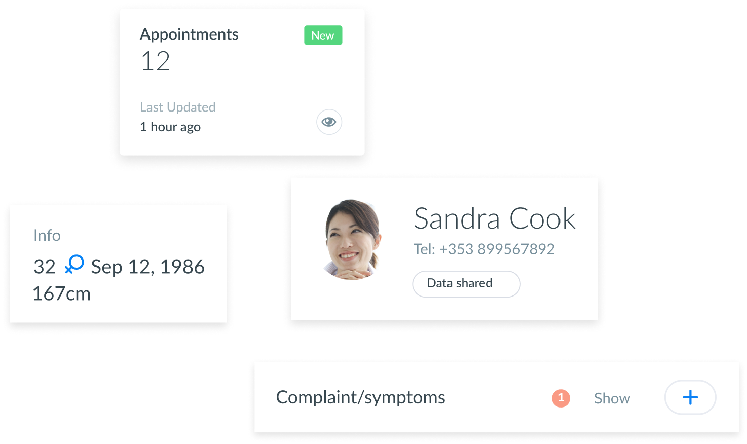
Doctor's dashboard

Once the clinic has received the medical data shared, the doctor can easily check all information (such as past surgeries, medical history, vaccinations) through a dashboard. The doctor can also add or update these records during a visit, which will update tthe Blockchain as a new block.

Next up

Innobook

Repository application that store innovative demos.